· Tableau · 3 min read
Navigating the Worksheets Pane in Tableau
Intro
In this blog post, we’ll take a closer look at the worksheet view in Tableau, the building blocks of everything else Tableau can do. We’ll start by discussing the different parts of a worksheet, including the data pane, shelves, and the ‘Show Me’ panel. Next, we’ll dive into the marks pane, the customization center of your visualizations, where you can change the color, shape, labels, tooltips, size, and details of your marks. By the end of this post, you’ll have a better understanding of how the worksheet view works and how to use it to create effective visualizations.
In this post, we'll take a closer look at the Objects Panel in Tableau, a pane that displays a list of objects
Navigating a Worksheet View
One of the first things you’ll want to get very familiar with as you start to use Tableau is the worksheet view. Worksheets are the building blocks of everything else Tableau can do - it’s where you make your beautiful visualisations!
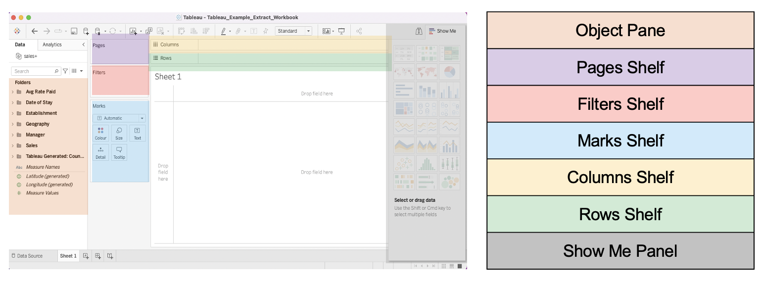
Tableau worksheets are made up of:
-
The data pane - this is where all your fields live, ready to be dragged into place!
-
Shelves. These are areas that you can drag and drop fields onto and they have different functions:
- The columns shelf is where to drag fields that you want on the columns/vertical axis of your visualisation
- The rows shelf is where to drag fields that you want in the rows/horizontal axis of your visualisations
- Drag fields that you want to filter your visualisation by onto the filters shelf
- The pages shelf is for advanced users and is where you can put fields you want to use to create interactive pages in your visualisations. You can use the pages shelf to display different views of your data based on a particular dimension such as time.
- The marks shelf is where you can really start to customise your visualisations. Change your visualisation type, add labels, edit tooltips and more!
All of these shelves are waiting for you to drag and drop your fields onto. Just remember - always start with a fresh field ‘pill’ from the data pane: if you drag a pill between shelves you’ll remove it from where it was as well as adding it to where you want it!
-
The ‘Show Me’ panel is a menu of quick visualisations you can use as a starting point. It contains the most common types of visualisation you might want, as well as giving handy pointers about the pre-requisites you need to use them
Deep Dive: The Marks Pane
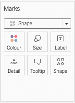
The marks pane is the customisation centre of your visualisations. You can use it to do almost anything, but the top things you will use it for are:
- Configuring your colour palettes using the ‘colour’ tile. If you drag a field onto the colour tile your visualisation will be coloured by the contents of that field.
- Changing your default shapes using the ‘shape’ tile. Maybe you don’t always want to use circles to show your data - the world is your oyster with this function (you can even load custom images!)
- You can change how your data is labelled using the label tile
- Want to keep a clean view while letting your report users have access to more the information in the background? Tooltips are your answer - drag fields onto the tooltips shelf and click on the shelf to customise your tooltips. You can even embed worksheets in your tooltips!
- Use the size tile to change the size of your marks
- Use the detail tile to split your data further on your visualisations without necessarily adding colour/shape/size
In the drop down at the top of the page you can also take your pick of visualisation types, meaning you can step away from the Show Me panel if you need to.
Get an overview of the Show Me pane in Tableau and learn how to use it to easily create beautiful visualizations in this blog post.