· Pandas · 4 min read
Your first visualisation with Python Pandas

Intro
We’re now ready to start creating visualisations. Onto the fun stuff!
Aggregating data refers to the process of summarizing data by grouping it and applying statistical functions to the groups.
For different visualisations, we will need to create different aggregations of data. Make sure for each aggregation you are giving it a different variable name.
Histogram
A histogram is a graph that shows the distribution of a dataset. It is a useful tool for understanding the spread and shape of the data, and can be used to identify patterns and outliers.
Let’s get a rough idea of the shape of our data/revenue metric across all of our establishments with a histogram. The first thing I’m going to do is ensure we have an aggregation of just estKey and salesValue.
Getting data ready
estRev_agg = df.groupby(['estKey'])['salesValue'].agg(['sum']).rename(columns={'sum': 'TotalSales'})

estRev_agg.head()
Creating visualisation
One thing I’m going to do is divide the Total Sales by 1m so that we are displaying revenue in millions in our histogram. This is optional, just a good practice to make it more understandable to the users.
estRev_agg['TotalSales'] = (estRev_agg['TotalSales'] / 1000000).round(2)
estRev_agg['TotalSales'].plot.hist(bins=10)
Output
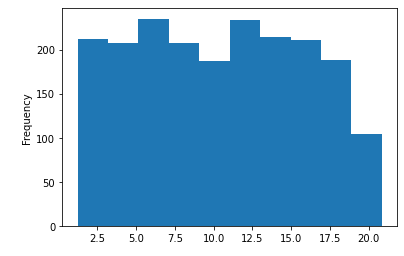
We can clearly see here a pretty equal spread across the board when it comes to revenue, which is actually great for an organisation. The only noticeable difference is there are less establishments in the bucket for revenue around 20 million.
Customising visualisation
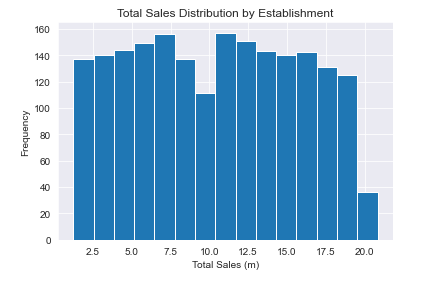
Let’s make this a little bit better. The default view doesn’t look great, and I wouldn’t be happy sending it for anyone to look at.
We’re going to use a couple additional libraries to help make our visualisations look nice. Those are seaborn and matplotlib. Both visualisation libraries that can be used with pandas.
We’re going to use Seaborn to get some nice defaults for our charts, and use matplotlib for labelling our axes. We have also added an increased number of bins for the histogram, which gives a more granular view of the data which I think is valuable.
import seaborn as sns
import matplotlib.pyplot as plt
sns.set_style('darkgrid')

estRev_agg = df.groupby(['estKey'])['salesValue'].agg(['sum']).rename(columns={'sum': 'TotalSales'})
estRev_agg['TotalSales'] = (estRev_agg['TotalSales'] / 1000000).round(2)

plt.title('Total Sales Distribution by Establishment')
plt.xlabel('Total Sales (m)')
plt.ylabel('Frequency (count of Establishment)')

estRev_agg['TotalSales'].plot.hist(bins=15)
sns.set_style('darkgrid')This is giving our chart the default styling.plt.title('Total Sales Distribution by Establishment')This is the titlexlabel/ylabelAre referencing the x/y axis and giving the names respectively.bins=15Adding the additional bins to the histogram
New chart
Hopefully this one looks a little better. You can definitely customise further, and we will go more in depth with this in future posts.
Line chart
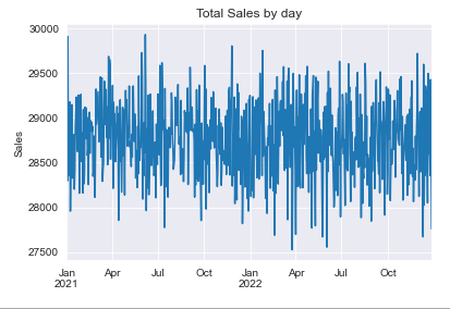
Let’s create a line chart showing total sales by day over time. I will add comments to the code to explain what is happening for each line
# Group the data by 'date' and compute the sum of the 'salesValue' column
salesByDay_agg = df.groupby('date')['salesValue'].agg(['sum']).rename(columns={'sum': 'TotalSales'})

# Convert the 'TotalSales' column to thousands and round to 2 decimal places
salesByDay_agg['TotalSales'] = (salesByDay_agg['TotalSales'] / 1000).round(2)

# Create a line chart of the 'TotalSales' column
salesByDay_agg['TotalSales'].plot.line()

# Add a title to the plot
plt.title('Total Sales by day')

# Turn off the x-axis label
plt.xlabel('')

# Add a label to the y-axis
plt.ylabel('Sales')

# Show the plot
plt.show()
Line chart output
Bar Chart
We’re doing almost the same thing here, but we are now grouping by month and monthCode. It’s important for getting the ordering correct, and that’s why we’re using .sort_values() on the data by the monthCode. That’s the main reason for having this column to be honest.
I’ve also made the bar chart a little bigger.
# Group the data by 'month' and 'month' code. Compute the sum of the 'salesValue' column
salesByDay_agg = df.groupby(['month', 'monthCode'])['salesValue'].agg(['sum']).rename(columns={'sum': 'TotalSales'}).sort_values(by=['monthCode'])

# Convert the 'TotalSales' column to millions and round to 2 decimal places
salesByDay_agg['TotalSales'] = (salesByDay_agg['TotalSales'] / 1000000).round(2)

# Set the size of the plot to 1000x600 pixels. /72 is converting to inches
plt.figure(figsize=(1000/72, 600/72))

# Create a line chart of the 'TotalSales' column
salesByDay_agg['TotalSales'].plot.bar()

# Add a title to the plot
plt.title('Total Sales by Month')

# Turn off the x-axis label
plt.xlabel('')

# Add a label to the y-axis
plt.ylabel('Sales')

# Show the plot
plt.show()
Bar chart output
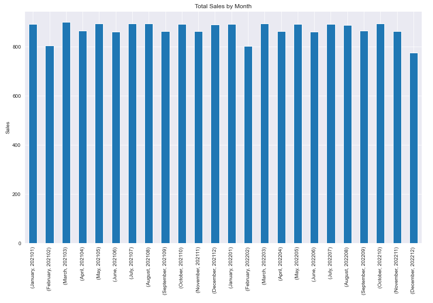
This show excellent consistency in sales, with February being the only slow month.
Conclusion
This brings the series on getting started with Pandas to a close. Now that you can aggregate and visualise your data, there is nothing stopping you diving deep into your data, in order to get more insights.