· Reporting · 9 min read
5 Expert Tips for Boosting the Effectiveness of Your Business Reporting
Intro
What makes great reports? We’re going to have a look at a few key things to take your reporting to the next level.
In this post, we will be discussing the importance of creating clear and concise report titles, well-organized and visually appealing layouts, and using relevant and accurate data in business intelligence reporting. It’s important to understand the importance of these factors in creating effective reports that convey key insights and information to stakeholders. In this post, we will delve into each of these elements in detail and provide tips and best practices for ensuring that your reports are of the highest quality. Whether you are a seasoned BI developer or just starting out in the field, we hope that this post will provide valuable insights and help you take your reporting skills to the next level.
A clear and concise report title that accurately reflects the content of the report
A clear and concise report title is essential for ensuring that the reader knows what to expect from the report and can easily understand the main topic or focus of the report. The title should accurately reflect the content of the report, meaning that it should clearly and accurately describe the main points or themes of the report. A well-written title will grab the reader’s attention and give them a sense of what the report is about, making it more likely that they will read and engage with the report.
It is important to keep the title brief and to the point, as a long or confusing title may discourage readers from continuing. Use keywords and phrases that accurately describe the content of the report, and avoid using jargon or technical terms that may not be familiar to all readers. A good rule of thumb is to aim for a title that is around 10-15 words in length, although this may vary depending on the specific context and audience of the report. Overall, the goal is to create a title that is both informative and compelling, and that accurately reflects the content and purpose of the report.
Well-organized and visually appealing layout, with appropriate use of headings, subheadings, and white space
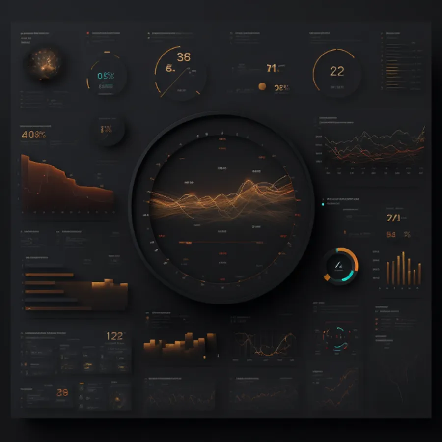
As a website developer, I understand the importance of creating user-friendly and visually appealing interfaces. This is why I am always looking for inspiration and new ideas. In my experience, the layout and design of a business intelligence report can have a big impact on its effectiveness and engagement. A well-organized and visually appealing layout, with appropriate use of headings, subheadings, and white space, can make a report easy to follow and understand. I have found that many of the principles of good design, such as those outlined in the book “Refactoring UI” can be applied to reporting to create reports that are both informative and engaging. Overall, a well-designed report not only conveys important information in an effective manner but also inspires and engages the reader.
Reporting Design Principles
Here are a few key design principles that can be applied to business intelligence reporting to create visually appealing and effective reports:
- Hierarchy: Use headings, subheadings, and white space to create a clear hierarchy of information, with the most important points highlighted at the top and the less important details relegated to lower levels. This helps the reader understand the main points of the report and follow the logical flow of information.
- Contrast: Use color, size, and other design elements to create contrast and draw the reader’s attention to important points. This can help highlight key findings and make the report more visually appealing.
- Alignment: Align elements on the page to create a cohesive and visually balanced layout. This helps to create a sense of order and makes the report easier to read and understand.
- Repetition: Use repetition of design elements, such as color, font, or layout, to create a cohesive and consistent look and feel for the report.
- Proximity: Group related items together to create a sense of unity and help the reader understand the relationships between different pieces of information.
By considering these design principles, you can create business intelligence reports that are visually appealing and effective at communicating key points and insights.
Relevant and accurate data
The quality and relevance of the data are of the utmost importance. A report that is based on inaccurate or irrelevant data will not be useful or effective, no matter how well it is designed or presented.
To ensure that your report contains relevant and accurate data, it is important to carefully consider the sources of your data and the methods used to collect and analyze it. Use reliable and trustworthy sources, and be sure to verify the accuracy of the data before including it in the report, along with continuous testing to ensure that the report stays accurate.
It is also important to ensure that the data you include in the report is relevant to the purpose of the report and the needs of the audience. Consider the questions or issues that the report is intended to address, and select data that is directly relevant to these questions or issues. This will help to ensure that the report is focused and valuable to the reader.
Actionable insights and recommendations based on the data presented
One of the main goals of a business intelligence report is to provide actionable insights and recommendations based on the data presented. Actionable insights are findings or conclusions that can be used to inform decision-making or guide action. They go beyond simply presenting data, and provide specific and practical recommendations for what to do next.
For example, if a business intelligence report was analyzing customer data to identify trends and patterns, the report might include actionable insights such as:
- “Customers who purchase product A are significantly more likely to also purchase product B. We recommend offering product B as a bundle with product A to increase sales."
- "Customers who visit the website on a mobile device are less likely to complete a purchase. We recommend improving the mobile user experience to increase conversion rates."
- "Customers who leave a review have a higher lifetime value. We recommend implementing a customer review program to encourage more reviews and increase customer loyalty.”
These types of insights provide specific and actionable recommendations that the business can implement to improve performance or achieve specific goals.
To create actionable insights, it is important to carefully analyze the data and consider the context in which it is being used. Look for patterns and trends that can inform decision-making, and consider the potential implications and consequences of different actions. Be sure to provide clear and specific recommendations, and explain the reasoning behind each recommendation.
In addition to actionable insights, it is also important to consider the limitations and uncertainties of the data and to provide appropriate context and disclaimers as needed. For example, if the data is based on a small sample size, it may not be representative of the entire population and should be interpreted with caution.
Overall, actionable insights are a key element of a successful business intelligence report. By providing specific and practical recommendations based on the data presented, you can help the reader make informed decisions and take action to achieve their goals.
A professional and polished appearance, including proper grammar and spelling
A professional and polished appearance is essential for creating a report that is effective and credible. This includes ensuring that the report is free of errors and has a clean, polished look and feel.
Proper grammar and spelling are essential for creating a report that is easy to read and understand. Incorrect grammar and spelling can be confusing and distracting for the reader and can undermine the credibility and professionalism of the report. To ensure that your report has a professional appearance, be sure to proofread the report carefully to catch any errors, and consider using a grammar checker or having someone else review the report for accuracy.
In addition to proper grammar and spelling, there are a number of other factors that contribute to a professional and polished appearance. These might include:
- Consistent formatting: Use consistent formatting throughout the report, including font, size, color, and layout, to create a cohesive and polished look.
- Attention to detail: Pay attention to the small details of the report, such as ensuring that all charts and graphs are properly labeled and that all figures are accurate.
- Careful use of language: Use clear, concise, and professional language throughout the report, avoiding jargon or technical terms that may not be familiar to all readers.
The effective use of visualizations
Visualizations are graphical representations of data that can help the reader understand and interpret the data more easily, and can be a powerful tool for conveying key points and insights.
There are many different types of visualizations that can be used in a report, including charts, graphs, maps, and infographics. Each type of visualization has its own strengths and can be used to effectively convey different types of data and insights.
For example, bar charts and line graphs are effective at showing trends and changes over time, while scatter plots and bubble charts are useful for showing relationships between different variables. Maps can be used to show spatial data and patterns, and infographics can be used to present complex data in a more visually appealing and easily understandable format.
When using visualizations in a report, it is important to consider the following factors:
- Relevance: Use visualizations that are relevant to the data and the purpose of the report. Don’t include visualizations just for the sake of including them; make sure they add value and help the reader understand the data.
- Clarity: Use clear and concise labelling and titles for the visualizations, and avoid using too many visualizations in one report. Too many visualizations can be overwhelming and may distract from the main message.
- Aesthetics: Use appropriate design elements, such as colour, size, and layout, to enhance the visual appeal and clarity of the visualizations.
Conclusion
By following these principles, you can create reports that are informative, engaging, and effective at communicating key insights and findings to your audience. As a developer, it is important to continuously strive for excellence in your work and to constantly seek out new ways to improve your skills and knowledge. By following these guidelines and continuing to learn and grow, you can become a valuable asset to your organization and a leader in the field of business intelligence.